
This site contains affiliate links, view the disclosure for more information.
The bathroom was in the new addition part of the home, which came with its unexpected challenges. It’s so easy in additions to make things feel stale and boring, so I really wanted to make sure I was adding some life to the space, not taking it away. That’s why relying on trusted local bathroom renovations services can make all the difference, ensuring a fresh, stylish, and functional design that enhances the overall aesthetic. Working with a skilled remodeling contractor can also help bring creative solutions to these challenges, ensuring every detail complements the new addition perfectly.
One of the best parts about renovating a bathroom is getting to infuse your personality into every little detail. I recently worked with a reputable company like the Brisbane Bathroom Renovation company to bring my vision to life, and I’m thrilled with the outcome. I wanted a space that felt fresh and exciting, not just functional. The right tile pattern can completely transform the vibe, and I couldn’t be happier with the result.
It’s not just about choosing colors and shapes; it’s about creating an atmosphere that makes you feel at home every time you step in. Choosing services like all around reglazing can further enhance that atmosphere by restoring your surfaces to look fresh, modern, and beautifully maintained. With the right updates, you can turn any space, even an addition, into something that feels like a unique retreat. See why customers choose Baths R Us for transforming their bathroom spaces with style and comfort.
If you’re considering a bathroom renovation, it’s important to think about the long-term impact and the overall feel of your space. Whether it’s bold tiles or investing in a luxurious addition like those a Hot Tub in Liverpool, every choice can elevate the experience.
Don’t shy away from taking risks—sometimes the most unexpected decisions end up making the biggest impact. And remember, creating a space that you’ll enjoy day after day is always worth the effort.

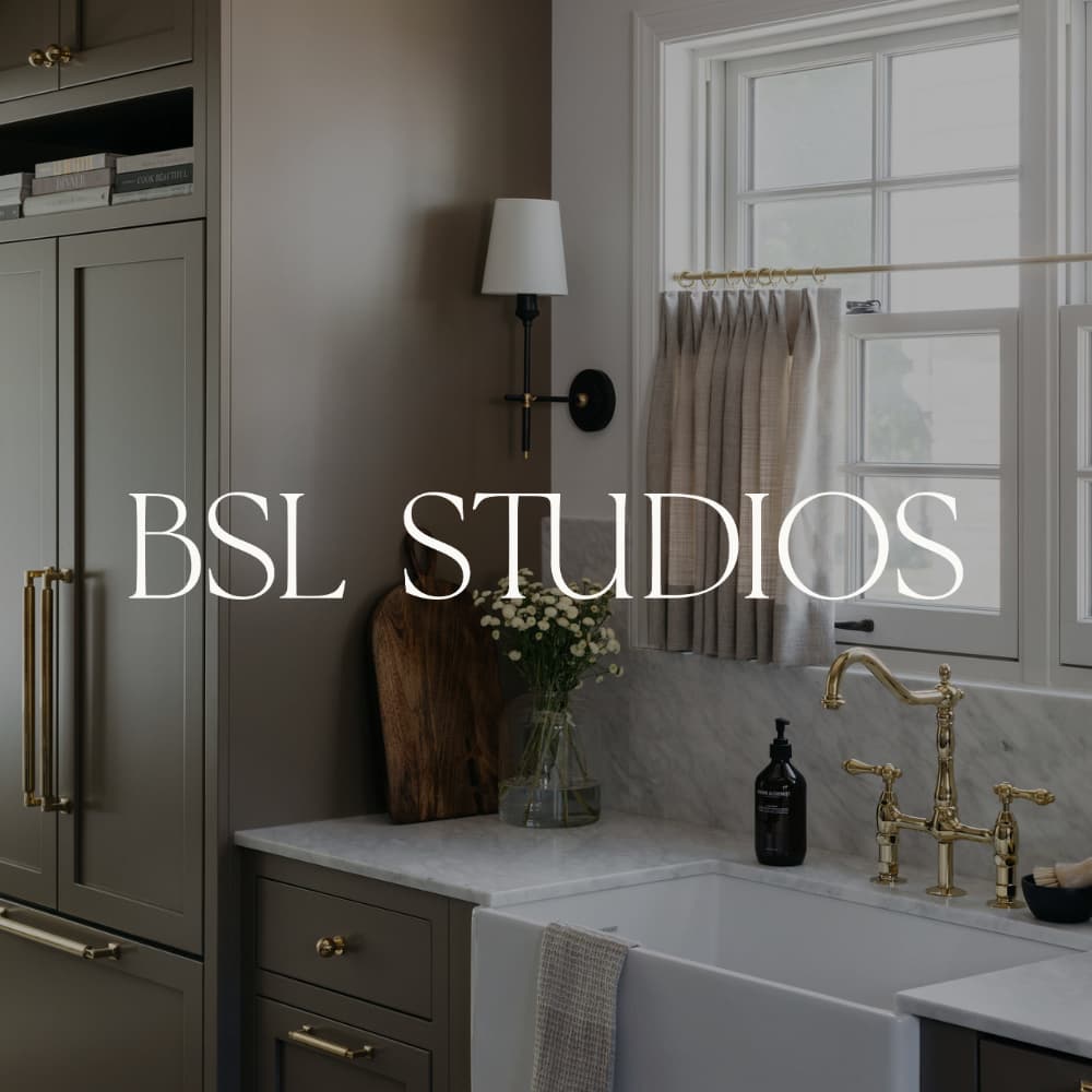
Cabinet Hardware | Faucet | Mirrors | Lights
Since the tile is really the *wow* factor in the space, let’s start there. This is handmade tile from Morocco. It is STUNNING. Debatably, the most beautiful tile I have ever seen! Apparently it was an absolute bitch to install because of how thick and irregular they are (so sorry about that).
I actually got the tiles from two different companies. The blue tile is from Zia Tile in the color “slate gray”. The white tile is from Cle Tile in the color “weathered white”. We were actually going to use the white tile throughout the kitchen as well but decided to nix the idea. We have a ton leftover so be prepared to see that in the next BSL restoration too. #notcomplaining 😉
I wanted the grout to blend in with the tile. I feel like the tile is a showstopper enough that I didn’t want to take any attention away from it. I had the blue tile matched as close to a grout as possible and for the white tile, we just used a standard white grout.

In this whole process of restoring this home, I realized I have a knack for cabinetry. I looveee cabinets. I designed this vanity and then had it built custom. The wood is white oak and we put a really light stain on it. I loved the color of the white oak so I really didn’t want to take anything away from that!
The countertop is marble – same slab that we used in the kitchen.

The mirrors are the only thing in this room that drive me crazyyyy :(. I love the actual mirror, but they’re slightly off center to the sink. That type of stuff drives my type-A self CRAZY. I’ve walked a lot of family and friends through the home and ask them to spot what’s off about the bathroom and no one seems to notice so I am starting to realize this is a ~me~ problem haha.
Bet your bottom dollar though that I will be triple measuring at the next house to make sure I get the lights hung exactly where they should be so the mirror doesn’t become problematic.

Because the tile is so thick, we decided to add tongue & groove around the room. It really made the room feel polished and complete. I think if we left the blue tile raw at the top it would have looked incomplete.
Around the rest of the home we used “Simply White” by Benjamin Moore for the paint color but in here, because the white tile pulled a little creamier, we used the paint color “Calm” by Benjamin Moore. It is beautiful!!

Shower details linked above.
This. Shower.

All details in this picture linked above.
If you follow me on insta, you know about my vintage light scamming. I bought a light from Etsy and was obsessed with it. I loved that it was “vintage” and thought it would be the perfect way to add a little more character into the space. Come to find out that not only was the freaking light not vintage at all, but it also didn’t work with US electrical coding.
Getting lights right now is a pain in the butt so I scored with being able to get these new bathroom lights within the same week (literally unheard of so a miracle haha). I really do love them!!

Sink | AESOP Hand Wash | Faucet | Lights